CORONAVIRUS (COVID-19) AND SCSBC’S RESPONSE: Find the lastest updates here for students, faculty and staff.
CORONAVIRUS (COVID-19) AND SCSBC’S RESPONSE: Find the lastest updates here for students, faculty and staff.
by Kevin van der Leek, SCSBC Graphic Designer ◊
Organizations typically experience brand renewal over the course of their existence. SCSBC is no exception: the previous logo has been part of the SCSBC brand for over twenty years – about the same time as the logo before it! Reasons for re-branding are numerous: repositioning, change in mission, addressing audience misperceptions, or, in our case, a move into a new office space in a new building, still on the Trinity Western University campus.
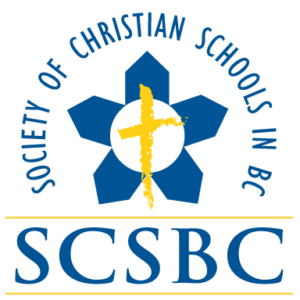
Our new logo is a departure from what was, but if you look closely, it builds on the logo it replaces.

The previous SCSBC logo contained five “school houses” that formed a circle. Five symbolized the “many” schools in the Society and referenced BC’s official flower, the dogwood. The circle represented the unity of vision shared by these schools.
But the number five has additional significance for SCSBC. Our website’s job board divides the province into five regions: Vancouver Island and Sunshine Coast, Northern, Okanagan and Interior, Fraser Valley, and Greater Vancouver. Plus, our SCSBC services are divided into five categories (represented by our five directors): Finance, Development, Leadership, Learning, and Educational Support. And you’ll see in the new logo that there are now two sets of “five”: five blue “petals” and five yellow “petals.”

For the sake of brand continuity, we retained the blue and bright yellow people associate with the organization. Additionally, these colours nicely mirror the BC brand colours. We tweaked the colours slightly, giving the yellow a little more punch and shifting the blue a bit more towards green. Overall, we believe these changes improve visibility and enhance visual interest.
There is a bit of a “pinwheel” quality to our new logo. We wanted our new brand to say something about the exuberance of learning and participating in God’s good creation. The new logo has energy and movement but also is clean and simple, making it not only recognizable but memorable.
So much of a successful brand is dependent on what is reflected back onto it. A logo can only say so much, but in time, a brand reflects back the qualities of the organization itself. We hope that a new brand – like our previous brand iterations – will be something for us to aspire to. We want SCSBC to continue being a place where our member schools can receive significant, wise, and exuberant support and services. And we will continue to be a faithful channel of Christ’s work in Christian schools in British Columbia.